Using TikTok's logo wrong can get your content flagged, your ad account suspended, or your shop listing pulled. Whether you're building a pitch deck, designing a landing page, or running a co-branded campaign, TikTok brand guidelines exist to protect TikTok's identity, and ignoring them creates real problems. Most people assume slapping the logo on a slide is fine. It's not that simple.
At SocialRevver, we build short-form content systems for founders and business owners scaling on TikTok. That means our team works inside TikTok's ecosystem daily, from production and distribution to branded visuals and platform-compliant creative. Knowing exactly how TikTok allows (and restricts) the use of its brand assets isn't optional for us. It's part of the job.
This guide breaks down everything you need: official logo files, approved color codes, required spacing, and the specific usage rules TikTok enforces across marketing materials, developer projects, and shop listings. Every detail is pulled directly from TikTok's own brand resources so you can reference the brand correctly without guessing or risking a violation.
What these guidelines cover and who needs them
TikTok's brand guidelines are a formal set of rules governing how third parties can reference TikTok's name, logos, icons, colors, and typefaces in their own materials. These rules apply any time your content, product, or promotional material includes a TikTok asset, whether you're building a landing page, launching a co-branded campaign, or listing products on TikTok Shop. The tiktok brand guidelines are not optional suggestions. They represent TikTok's legal and design standards, and TikTok enforces them through its platform policies, advertising review systems, and developer program terms.
Treating TikTok's assets like free-to-use stock art is the fastest path to a takedown notice, a rejected ad, or a suspended account.
What the guidelines actually cover
The rules break down into five distinct categories. Understanding each one up front saves you from having to backtrack and fix materials after they've already been flagged or rejected.
| Category | What it governs |
|---|---|
| Naming conventions | How to write "TikTok" in text, including capitalization, possessives, and pluralization |
| Logo and icon usage | Approved file types, minimum sizes, required clear space, and permitted color variations |
| Color and typography | Official hex codes, font usage, and when you may or may not use TikTok's visual palette |
| Prohibited modifications | Actions you cannot take, such as recoloring the logo, stretching it, or placing it on low-contrast backgrounds |
| Contextual rules | How the brand must appear in specific environments like app stores, developer docs, advertising, and TikTok Shop |
Each category has specific requirements you need to meet before your materials go live. Skipping one category, even unintentionally, can invalidate your compliance with the others.
Who actually needs to follow these rules
These guidelines apply to a broader group than most people expect. If your work touches TikTok's name or visuals in any professional context, you are subject to them. Specifically, you need to follow these rules if you fall into any of these categories:
- Business owners and founders running paid or organic campaigns that mention or display TikTok
- Developers building apps, integrations, or tools that connect to TikTok's API or platform
- Agencies and content teams producing client deliverables, reports, or pitch materials that reference TikTok
- TikTok Shop sellers using TikTok's branding on storefronts, product listings, or off-platform promotions
- Brands and creators producing co-marketing assets, media kits, or sponsored content
The list is intentionally wide. TikTok's terms do not carve out exceptions for small businesses, solo creators, or internal use only materials. If the asset is visible and connected to TikTok's identity, the rules apply.
Why these rules exist
TikTok enforces these guidelines to protect brand consistency and legal ownership of its intellectual property. When any third party modifies TikTok's logo, misspells its name, or uses unofficial color variations, it creates confusion in the market and weakens the trademark protection TikTok holds over its assets. From TikTok's perspective, every unauthorized use is a legal and reputational risk they need to control.
From your perspective, understanding these rules protects your business too. A co-branded piece of content that violates TikTok's guidelines can get your advertising account reviewed, your TikTok Shop listing removed, or your developer access revoked. Following the rules correctly is not just about compliance for its own sake. It is about keeping your access to the platform and its ecosystem intact so your marketing and monetization efforts do not get interrupted mid-campaign.
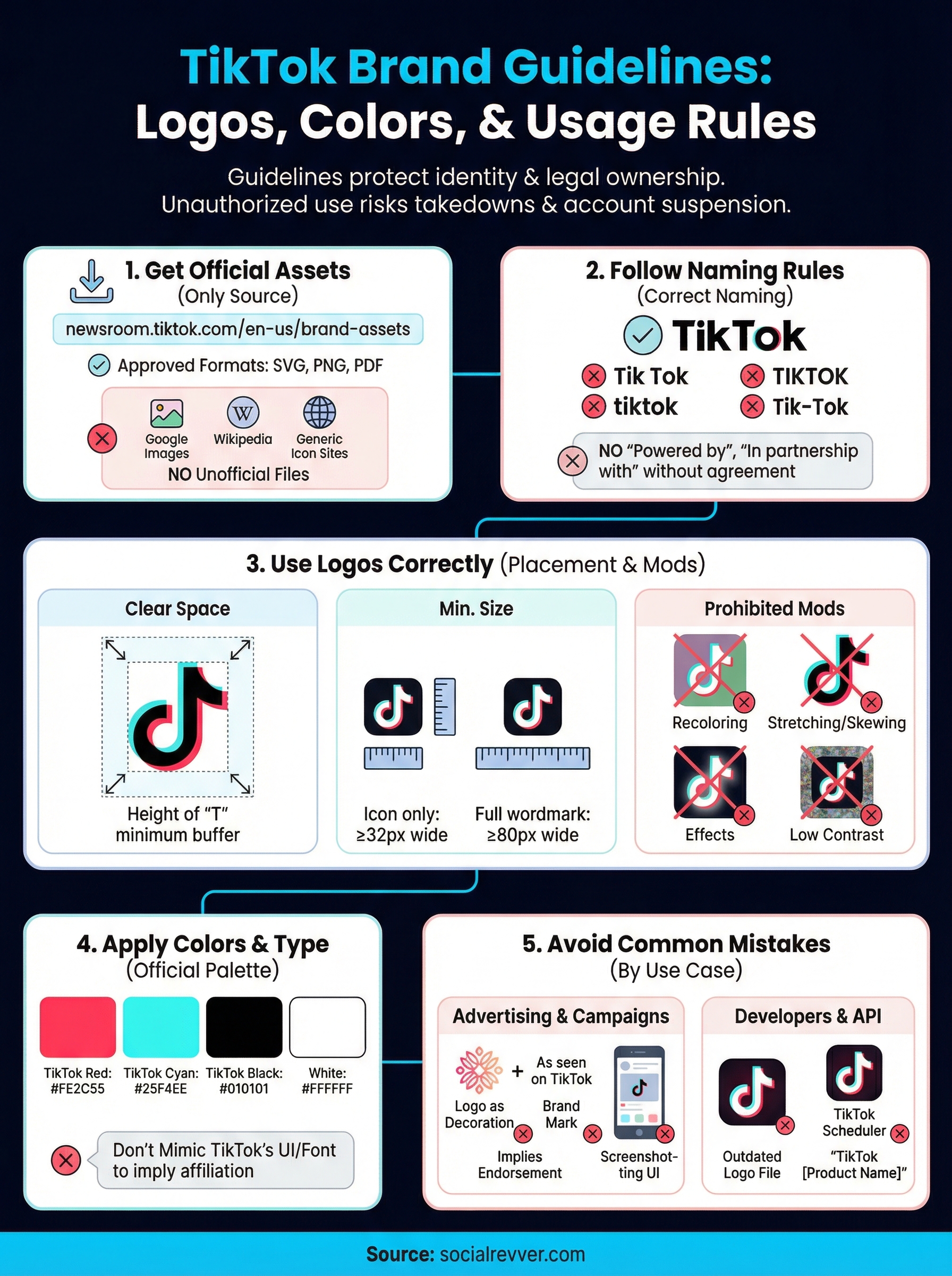
Step 1. Get official TikTok brand assets
Before you design anything, you need to download assets from the only legitimate source: TikTok's official brand resource page. Using logos pulled from Google Images, Wikipedia, or third-party icon sites is a violation of the tiktok brand guidelines from the start. Those files are often outdated, modified, or stored in formats that do not meet TikTok's specifications. Start clean with files from TikTok directly.
Using unofficial logo files is not a minor shortcut. It puts your materials out of compliance before you have even opened your design tool.
Where to find TikTok's official brand kit
TikTok hosts its brand kit at newsroom.tiktok.com/en-us/brand-assets. That page gives you access to approved logo files, icon variations, and the brand guidelines document itself. You do not need an account to access the page, but you will need to agree to TikTok's brand usage terms before downloading. Read those terms before clicking through. They are part of the compliance framework that applies the moment you start using TikTok's assets in your materials.
The brand kit page provides downloads in the following formats:
- SVG for scalable vector use in web and design applications
- PNG with transparent backgrounds for digital placements
- PDF versions of the brand guidelines document for offline reference
Always download directly from this page each time you start a new project. TikTok updates its brand assets when the visual identity evolves, and using a file you downloaded months ago may not reflect the current approved specifications.
What's included in the download
The brand kit contains more than just a logo file. Inside the package, you will find the primary wordmark, the standalone icon, and multiple approved color variations for each. Each variation is designed for a specific background context, so you need to understand what you are looking at before selecting a file for your project.
Here is a quick reference for what each variation is built for:
| Asset | Intended use |
|---|---|
| Full wordmark (black) | Light backgrounds, print materials |
| Full wordmark (white) | Dark backgrounds, video overlays |
| Icon only (color) | App store badges, social profiles |
| Icon only (black/white) | Single-color print or embroidery |
Pick the correct variation for your context before moving to layout. Swapping variations mid-project creates inconsistency across your materials and forces rework you could have avoided.
Step 2. Follow TikTok naming rules in copy
Most brand violations do not happen in the design file. They happen in the body copy, headlines, and captions where people write TikTok's name without checking how TikTok requires it to appear. The tiktok brand guidelines include specific naming rules that apply to every piece of written content referencing the platform. Whether you are writing ad copy, a press release, a pitch deck slide, or a product listing, these rules govern what you are allowed to write.
Write the name correctly every time
"TikTok" is always written as one word with a capital T and a capital K. It is never written as "Tik Tok," "tiktok," "TIKTOK," or "Tik-Tok." That applies in headlines, body text, captions, URLs you control, and any other written context where the name appears. The capitalization is not a style preference. It is a trademark requirement, and deviating from it in commercial materials can trigger a compliance review.
Getting the name wrong in a paid ad is one of the most common reasons TikTok's review system flags branded creative before it ever reaches an audience.
Here is a quick reference for what is allowed and what is not:
| Usage | Correct | Incorrect |
|---|---|---|
| Standard mention | TikTok | Tik Tok, tiktok, TIK TOK |
| Describing the platform | the TikTok app, TikTok platform | the Tik-Tok app |
| Referring to users | TikTok users, people on TikTok | TikTokers (avoid unless in informal editorial only) |
| Possessive form | content on TikTok | TikTok's users (avoid implying ownership of people) |
Avoid restricted language patterns
TikTok does not allow you to use its name in ways that suggest partnership, endorsement, or sponsorship unless you have a formal agreement in place. Writing phrases like "Powered by TikTok," "In partnership with TikTok," or "TikTok approved" in your marketing materials without an official deal violates the naming rules directly. These phrases imply a commercial relationship that TikTok has not authorized.
You also cannot use TikTok's name as a verb. Writing "TikTok your product launch" or "TikTok it" in copy treats the trademark as a generic action word, which weakens the trademark and is explicitly prohibited. Keep the name as a proper noun referring to the platform only. That rule applies to social captions, email subject lines, ad headlines, and any other written format connected to your brand.
Step 3. Use TikTok logos and icons correctly
Downloading the right file is only the first move. How you place, size, and treat the logo in your actual layout determines whether your materials meet the tiktok brand guidelines or violate them. TikTok's rules on logo usage are specific, and the most common errors happen at the placement stage, not during the download. Before your design goes to print, a client, or a platform review queue, run it against the requirements below.
Respect required clear space
Every version of the TikTok logo requires protected clear space on all four sides. Clear space is the minimum buffer zone between the logo and any other visual element, including text, imagery, borders, and background edges. TikTok defines this minimum as the height of the "T" in the TikTok wordmark on each side. Measure that letter in your layout, then apply that exact distance as padding around the entire logo.
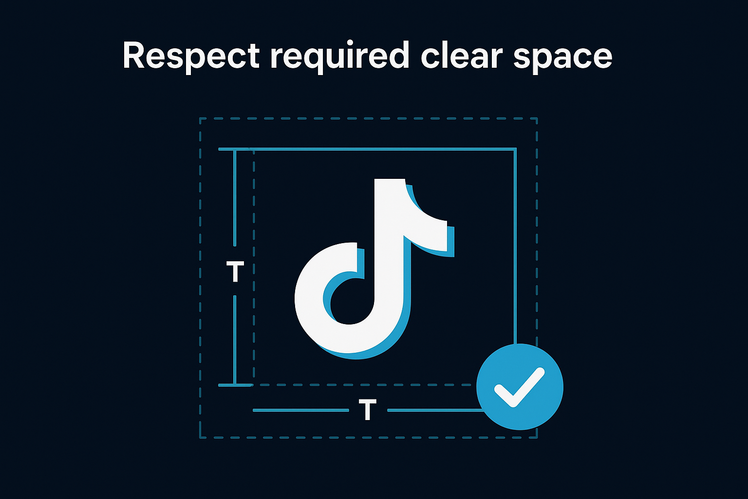
Crowding the logo with surrounding elements is one of the most common compliance failures in co-branded creative, and it is entirely avoidable with a single measurement.
Never position the logo flush against a content block, overlapping an image, or sitting directly at the edge of a slide or banner. Each placement needs the full clear space buffer to meet the required standard.
Set a minimum display size
TikTok requires the logo to remain legible and visually intact at all sizes. The icon should never appear smaller than 32px wide in digital formats, and the full wordmark should never appear smaller than 80px wide. Below those thresholds, the logo detail degrades, which creates a compliance issue and a visual quality problem at the same time. For print, apply the same proportional logic and test legibility on physical output before finalizing.
Avoid prohibited modifications
The list of restricted actions on TikTok's logo is explicit. Applying any of the following to the logo or icon puts your materials out of compliance immediately:
- Recoloring the logo to any shade not included in the official brand kit
- Stretching, compressing, or skewing the logo proportions
- Applying drop shadows, gradients, outlines, or glows
- Placing the logo on a background color that creates low contrast or visual interference
- Rotating the logo to any angle other than its standard horizontal orientation
- Combining the TikTok logo with your own brand mark in a way that suggests a merged identity
Each restriction is in place to protect the visual integrity of TikTok's trademark, and none of them have exceptions for small formats or internal documents.
Step 4. Apply color, type, and layout rules
Color and typography are the parts of the tiktok brand guidelines that most designers treat as flexible, and that assumption creates the most visible compliance failures. TikTok's visual identity is built around a specific palette and a defined typographic system, and both are non-negotiable when your materials reference the TikTok brand. You cannot substitute brand colors with close approximations or swap in your own typeface where TikTok's is specified.
Use TikTok's official color codes
TikTok's brand palette uses three primary colors that appear across its logo, interface, and marketing. When you include TikTok's visual identity elements in your layouts, you must pull from these exact hex values rather than eyedropping colors from a screenshot or estimating from memory. A near-match is still a violation.
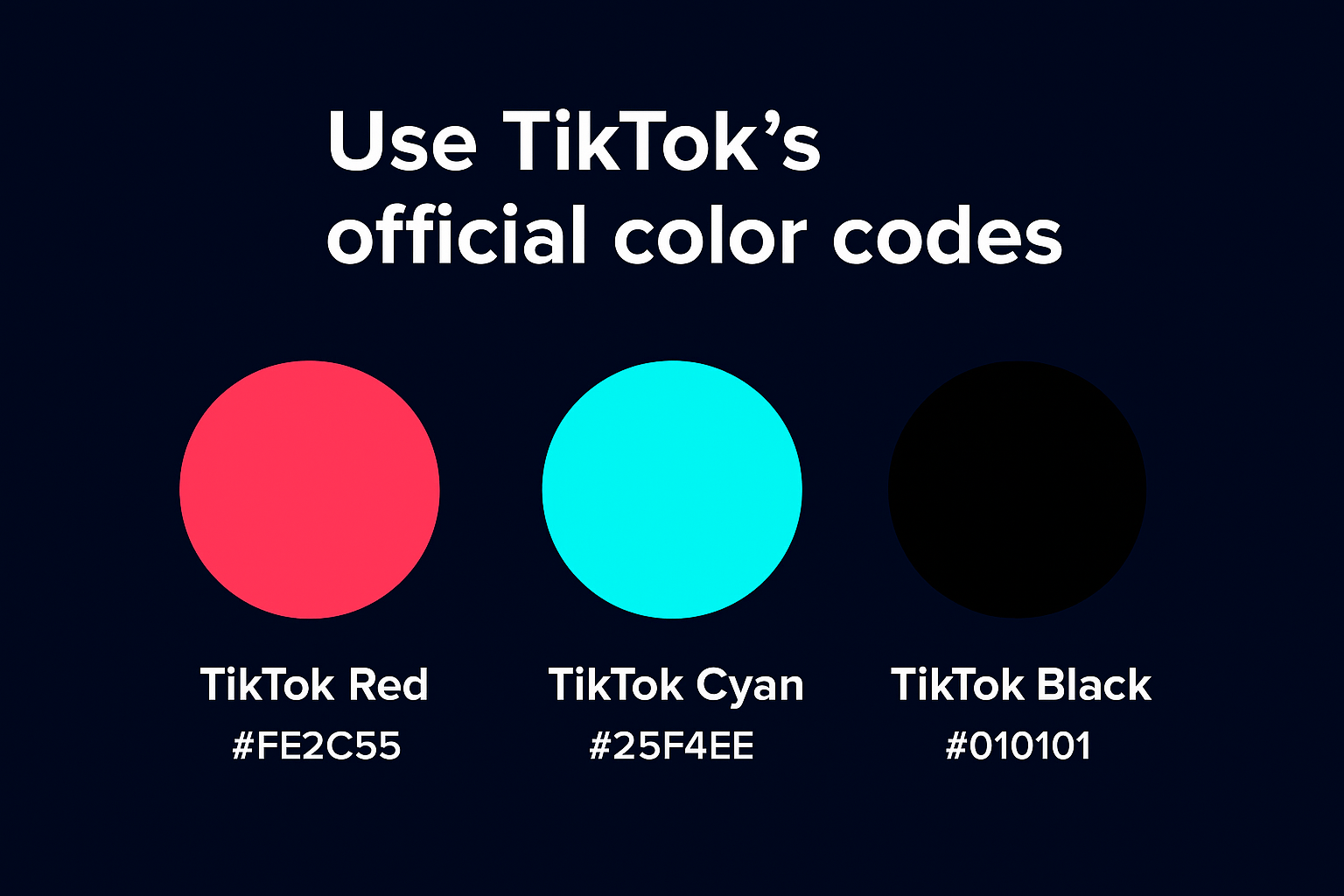
Using an approximate color that "looks close" on screen will still fail a compliance review because it misrepresents TikTok's trademark.
Here are the official values you need to reference:
| Color name | Hex code | RGB values | Use case |
|---|---|---|---|
| TikTok Red | #FE2C55 | 254, 44, 85 | Primary brand accent, icon |
| TikTok Cyan | #25F4EE | 37, 244, 238 | Secondary accent, icon |
| TikTok Black | #010101 | 1, 1, 1 | Wordmark, dark backgrounds |
| White | #FFFFFF | 255, 255, 255 | Reversed logo, light layouts |
Apply these values in your design tool's color picker directly. Save them as named swatches in your project file so your team pulls from the correct values on every iteration, not from memory.
Follow the typography rules
TikTok's brand typeface is Proxima Nova, and the guidelines specify where and how it appears in official TikTok communications. If you are producing co-branded materials or developer documentation that follows TikTok's visual system, you should use Proxima Nova to stay aligned. However, TikTok does not require third parties to use its internal typeface in their own brand materials. The restriction is clearer: you cannot replicate TikTok's typographic layout in a way that makes your content look like an official TikTok product or communication.
In practice, that means you should not use the same font, size, color combination, and layout structure that TikTok uses in its own UI to present your brand's content. Mimicking TikTok's interface design in a way that could mislead users into thinking they are interacting with native TikTok content is a direct violation of both the brand guidelines and the platform's terms of service.
Step 5. Avoid common mistakes across use cases
The tiktok brand guidelines cover multiple contexts, and the rules shift depending on what you are building. A mistake in a paid ad looks different from a mistake in a developer integration or a TikTok Shop listing. Knowing the most common errors by use case lets you catch problems before they get reviewed, rejected, or flagged. The violations below repeat across industries and project types, which means they are predictable and avoidable if you know where to look.
Mistakes in advertising and campaign materials
Paid ads go through a review process that checks brand asset usage automatically. The most frequent failure point is using the TikTok logo as a decorative element in a way that implies TikTok co-signed the campaign. Placing the logo next to your brand mark with copy like "As seen on TikTok" can read as an endorsement claim, and TikTok's review system will catch it.
Implying TikTok endorses your product without a formal brand partnership agreement is one of the fastest ways to get your ad creative rejected before it ever runs.
The second common mistake is screenshotting TikTok's interface and using it as a background or product mockup in your ad. Screenshots contain TikTok's UI elements, fonts, and visual layout, all of which are protected. Use only assets from the official brand kit, and build mockups using sanctioned templates or neutral device frames instead.
| Mistake | Why it fails | Fix |
|---|---|---|
| Logo next to brand mark | Implies merged identity | Keep logos separate with clear space |
| "As seen on TikTok" copy | Implies endorsement | Rewrite to "available on TikTok" |
| Interface screenshot as background | Uses protected UI elements | Use official assets only |
| Custom-colored icon | Modifies protected trademark | Use only approved color variants |
Mistakes in developer and API projects
Developers make a specific set of errors that differ from marketing teams. The most common is using an outdated logo file pulled from a previous project or a third-party icon library. TikTok updates its visual identity, and an old file may not match current specifications.
Another frequent issue is labeling your app or tool in a way that sounds like a TikTok product. App names, documentation headers, and feature names that use TikTok as a prefix, such as "TikTok Scheduler" or "TikTok Analytics Pro," violate the naming rules by implying an official affiliation that does not exist. Rename any product feature that uses TikTok as a modifier and replace it with a description of the function instead.
Next Steps
Following the tiktok brand guidelines correctly is not a one-time task. TikTok updates its brand assets and usage rules as the platform evolves, so check the official brand resource page each time you start a new project and anytime you hear about a platform update. Download fresh files, verify hex codes, and review the naming rules before you finalize any material that references TikTok's identity.
Your brand's presence on TikTok should also be generating consistent leads and authority, not just staying compliant. Building a content system that produces platform-compliant, high-performing short-form video at scale requires more than design rules. It requires a repeatable production and distribution process built around your niche, your voice, and your audience's behavior. If you want that system built for you, apply to work with the SocialRevver team and get a free 40+ slide social media strategy tailored to your business.